Lightroom is the only tool I use for editing my photos. It’s pretty amazing how it handles light (it’s probably called Lightroom for a reason…) and color adjustments.
Mastering Lightroom requires creativity, technical know-how, and an eye for detail. Even the slightest adjustment can really change an image.
Here are seven Lightroom tips that I use daily to help you improve your edits.

7 Unique Lightroom Tips
Here are my 7 top tips to improve your Lightroom skills:
Using Incoming Sunlight
Using incoming sunlight is one of the best ways to make a photo more interesting. It can really add emotion and a feeling of time, so it can really ‘speak’ to the viewer.
I like to add a mask over the sunlight and enhance it with extra exposure, lowering the highlights to prevent overexposure and dehaze and clarity to add some shine. Sometimes, I also add some warmth to it.
What also works is adding a radial mask and shining one light beam on the subject.
- Golden Hour: Of course, shooting in the early morning or late afternoon is always great, but you can replicate the effect in Lightroom when you’re not that much of a morning person (like me). Add a linear mask over the sunlight to enhance it.
- Enhance with White Balance: Adjust the temperature slider to bring out golden hues for a moodier look. Only a little bit is usually enough.
- Lens Flares: Instead of avoiding flares, use Lightroom’s Dehaze and Contrast sliders to fine-tune their effect. Lower dehaze to create a really shining light.
- Boost Light beams: If sunlight hits a specific area, use a radial filter to enhance the glow and make it look more intentional.
- Use the Radial Filter: Select the overexposed areas and slightly bring down the highlights and whites.
In the photo below, taken in South Korea, I enhanced the incoming sunlight a lot, which creates some emotion and a sense of time to it.

Coloring Shadows
Shadows don’t always have to be just dark, empty spaces. They’re actually a great place to add color and mood to your photo. Since shadows often lean towards cooler tones, making them more blue or even slightly purple can reallyenhance the sense of depth and contrast in the photo.
- Split Toning (or Color Grading in newer versions): Add a subtle blue or teal tone to shadows for a cinematic look.
- HSL Panel: Adjust blues and purples to enhance shadows naturally without making them look artificial.
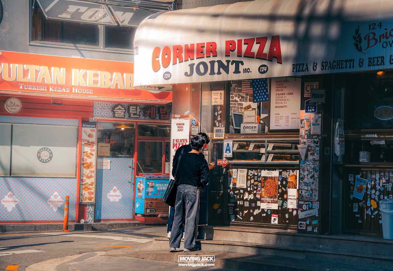
As you can see below in the photo taken in Itaewon, Seoul, the contrast of incoming warm sunlight against cold shadows always works well and makes a dull image a bit more interesting.

Make It Easy on the Eye
A great edit is also about creating an image that feels visually easy to the eye. When there are too many harsh lines or spots it can be difficult for the viewer to focus on whats important in the photo.
Lowering texture and clarity can give your image a softer, smoother look that is perfect for dreamy landscapes. Reducing texture smooths out fine details without losing depth while lowering clarity, slightly softening edges, and reducing harshness, creating a more polished and elegant feel.
It’s smart to enhance the sharpness of the image and not lose too much detail.
- Use the Crop Tool and Grid Overlay: Apply the thirds or golden ratio rule for natural composition.
- Clarity vs. Texture: I usually lower both of them but I enhance overall sharpness.
- Vignette Control: A subtle vignette (darkening around the edges) can draw focus to the subject without looking obvious. Make sure the ‘feather’ is on to have a smooth vignette.
In the image below, taken in Itaewon, all the houses have quite harsh lines and the image is filled with it. By reducing clarity a lot but keeping the sharpness the image becomes more pleasing to the eye.

Bring Out Your Subject
Your subject should usually stand out. A technique is to use masking to enhance the subject’s presence in the image. I always use the Select Subject masking tool to isolate your subject (or select the object tool). Increase clarity, Texture, and sharpness slightly to make it pop. Then, duplicate the mask and invert it so it affects the rest of the image. Lower the clarity and Texture on the inverted mask to create a subtle soft-focus effect, helping your subject stand out naturally against a smooth, dreamy background.
What I usually do is I remove some of the inverted mask by subtracting a part of the front of the image or objects close to the camera. When the entire image is smooth, it can look unnatural, as objects closer to the camera are usually sharper and clearer naturally.
- Selective Adjustments: Use radial filters or the brush tool to increase exposure, clarity, or sharpness on your subject.
- Background Blur Trick: Lower the Texture and clarity of the background slightly to create a larger depth-of-field effect.
- Color Separation: Boost the color of the person or subject slightly while desaturating the background to create a bigger contrast.
In the image below, taken in Seoul, the subject is really set apart from the back and foreground. This makes it easier for the viewer to focus on what’s the topic of the photo.

Bring Colors Together
Bringing colors together makes a huge difference in getting a more professional look. The trick is to shift certain colors so they blend more harmoniously together. For example, sliding green towards orange can makeit fit better with warm tones like yellow and red. However, be careful not to overdo it, a photo taken in spring shouldn’t really end up looking like it’s autumn!
In the HSL Panel, you can edit the hue and saturation of individual colors. I almost never use Luminance; I find that it creates ‘bands’ of colors—edges you can see when colors are darker or lighter than the other in an unnatural way.
HSL Panel Mastery: Adjust individual colors to bring them closer together (e.g., making greens and yellows blend smoothly).
- White Balance Tweaks: A warmer or cooler tone can help create harmony across different colors.
- Tone Curve Adjustments: A slight fade effect in shadows or highlights can help colors feel more cohesive.
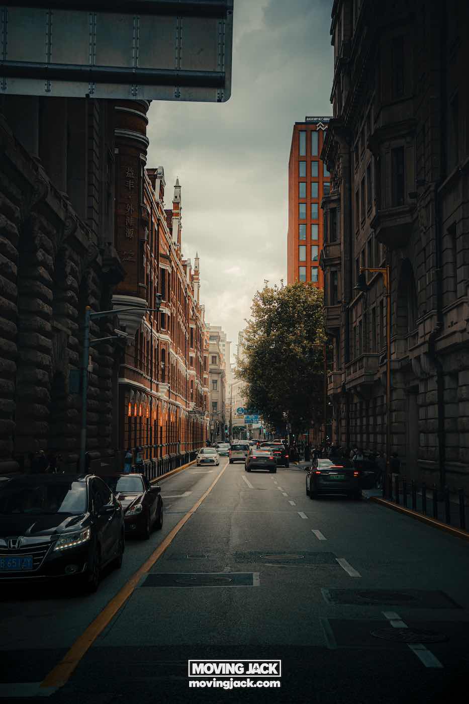
In the photo below, taken in Shanghai, the bag that the person is holding wasn’t orange at all! It’s was bright red so it kind of stood out too much. I adjusted the red color to make it look slightly more orange so it would fit the outfit and overall image so that it creates a more cohesive look.

Making Presets
Save a new preset after each significant edit! this way, you can track your progression and see how your presets improve over time. This has really helped me to get the final presets I wanted. I’ve made way over a 100 presets, but I only use several daily.
- Create Your Own Presets: Click the ‘+’ in the presets panel and save your favorite adjustments.
- Stack Presets: Use a base preset for color grading and layer smaller adjustment presets for consistency.
- Modify and Adapt: Presets are a great starting point, but always fine-tune them per image.
Fitting the Emotion of the Photo
Making edits is also about looking at the photo and editing it so it fits the mood or emotion. A warmer tone could be the way to go if the photo shows a positive emotion. On the other hand, if the image feels more neutral or cold, like a cold office building or just a photo in the winter, a cooler tone might be a better fit. So it’s really all about looking at the image and enhancing what it makes you feel.
- Use White Balance as a Creative Tool: Instead of just correcting colors, adjust for mood—warmer for golden hour, cooler for dramatic shots.
- Target Specific Areas: Use the brush tool to make parts warmer or cooler of an image instead of applying a global adjustment.
- Match to the Subject: Skin tones should always look natural, so balance warmth to suit them, then adjust the background accordingly.
The photo below of palace guard in Seoul is clearly shot in the winter so I wanted to boost that feeling of the cold.

Gear I Use
For editing my photos I use the Apple Studio Display. This is a much debated topic, but the Apple Studio Display is the only display capable of displaying 5K on a 27inch screen. This way, I can see all the details and know exactly what I am doing. Besides that, it has the same color settings as every other Apple Display, iPhone, iPad, etc. So it will already look good on a huge percentage of the displays out there.
I don’t know if it’s the perfect display for prints yet, as I haven’t printed out my photos yet.
Final Thoughts & Tips
Lightroom editing takes time, but when you create the image you had in your mind, it’s really cool.
I hope these unique tips will help you fine-tune your workflow and create even better edits that stand out.
Final thought; there’s no right or wrong. Remember, if it looks good, it is good!
What’s your favorite Lightroom trick? Let me know in the comments below!
F.A.Q. Lightroom
What’s the difference between Lightroom and Lightroom Classic?
The names of Lightroom and Lightroom classic can be quite confusing. Just “Lightroom” is actually “Lightroom CC, or aka Lightroom Mobile”. Lightroom Classic is a Desktop Program with some more features.
Here’s a breakdown:
- Cloud-Based vs. Desktop-Based:
- Lightroom (CC): It is cloud-based, meaning your photos are stored on Adobe’s cloud, and you can access them from any device (desktop, mobile, tablet). It’s designed for photographers who prefer to edit photos on the go.
- Lightroom Classic: It’s a desktop-only application with local storage. Your photos are stored on your own computer, and it’s ideal for photographers who work primarily on one machine or need more control over their photo management.
- User Interface and Experience:
- Lightroom (CC): It has a simpler interface and is a bit more easy for beginners.
- Lightroom Classic: It has a more traditional, feature-rich interface suited for experienced photographers who need more options such as the Calibration panel that is missing on Lightroom (CC).
- Editing and Organization Features:
- Lightroom (CC): It offers the basic editing tools with a focus on simplicity and accessibility. However, some advanced features like detailed printing options and local adjustments (e.g., gradients, brushes) are more limited.
- Lightroom Classic: Offers more advanced editing tools, such as a more detailed library panel, better file management, more export options, and precise local adjustments.
- Performance:
- Lightroom (CC): As it’s cloud-based, it might be slower to upload and sync large folders of photos.
- Lightroom Classic: Since it works with local files, it can process and edit images faster, especially if you have a fast computer.
- File Management:
- Lightroom (CC): Automatically organizes photos in the cloud and syncs them across devices.
- Lightroom Classic: Uses a catalog-based system, which means you manually manage folders and directories for your photos. It has a more detailed organization system with things as collections, keywords, and adjusting metadata.
When getting a subscription, both versions are now included nowadays.
Is Lightroom Classic better than Lightroom?
It’s not better; it’s different regarding features and editing workflow. If you prefer working in the cloud and need access to your photos from anywhere, Lightroom (CC) might be the best fit. However, Lightroom Classic is the way to go if you’re looking for more advanced features and local storage control.
I prefer Lightroom classic to edit my photos on my desktop with some more features.


![Renting a car in okinawa: insider guide + 8 best budget tips [2025] 35 lightroom tips A yellow and white compact suv is parked next to a silver sedan in a modern apartment parking lot on a sunny day, with blue sky and ocean visible in the background. -copyright-moving-jack. Com](https://moving-jack.com/wp-content/uploads/2025/10/okinawa-japan-car-rental-guide-asia-beach-holiday-tropical-ocean-outdoor-summer-copyright-moving-jack.com-13-3-527x351.jpg)
![Renting a car in okinawa: insider guide + 8 best budget tips [2025] 36 lightroom tips A yellow and white compact suv is parked next to a silver sedan in a modern apartment parking lot on a sunny day, with blue sky and ocean visible in the background. -copyright-moving-jack. Com](https://moving-jack.com/wp-content/uploads/2025/10/okinawa-japan-car-rental-guide-asia-beach-holiday-tropical-ocean-outdoor-summer-copyright-moving-jack.com-13-3-527x703.jpg)

